
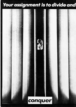
American conceptual/pop artist Barbara Kruger is internationally renowned for her signature black, white and red poster-style works of art that convey in-your-face messages on women's rights and issues of power. Coming out of the magazine publishing industry, Kruger knows precisely how to capture the viewer's attention with her bold and witty photomurals displayed on billboards, bus stops and public transportation as well as in major museums and galleries wordwide. She has edited books on cultural theory, including Remaking History for the Dia Foundation, and has published articles in the New York Times, Artforum, and other periodicals. Monographs on her work include Love for Sale, We Won't Play Nature to Your Culture and others. She is represented in New York by Mary Boone Gallery. A major exhibition of her work will be presented at the Museum of Contemporary Art in Los Angeles in fall 1999, and at the Whitney Museum in New York in 2000.
Research Kruger's work to find an example from the 1970s or 1980s to compare with a more recent work. How has Kruger's work changed with the developments in contemporary visual arts? Describe a recent work that moves away from the 'poster' type work of her early career.
Throughout her career she's used many different mediums varying from beads(simple arts and crafts) to photography. As her career progressed, so did her art. She refined her way of creating art until she found a style that suited her (black and white photo with red. white ban and black/white text). To me Kruger reminds me of Banksy in a way. With both of them having similar meanings in their work, both of the artists are very powerful within their statements. This work kind of reminds me of today’s society, our education system. What makes you think our education system is solid? For we know it could be a sinister plot for world domination for our corrupt leader? < Conspiracy! Lol!
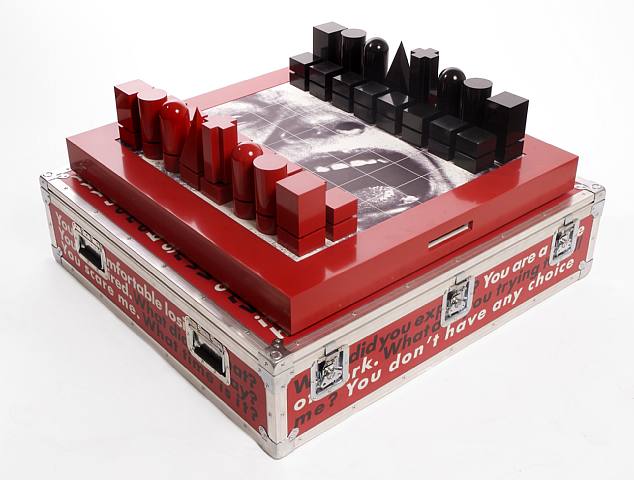
Thought it is a 3d work, you still see the influence of her posters present: the black and white photo and the red back and white coloured texts. The fact that it is a chess set makes this piece interesting. It reminds me of war, struggle against social norms and oppression. The image of the child screaming only assures my opinion even more, with her face being the expression of pain! < Am I even making sense?
Find 2-3 works by Kruger to add to your blog.


How does the audience experience a more spatial, installation artwork compared with a poster?
For everyone, you get a different answer. For me, the space and the level of interaction with the piece is what separates installation to poster art (which is probably what everyone else experiences> T^T
What elements does Kruger use in her work to create a strong impact?
BIG BOLD LETTERING!
The colours as well complement each other and allow for clear reading. The subjects in her work seem very minimal, so you’re not bombarded with visual information and unusual imagery (e.g. girl screaming, someone pricking their finger, George Bush…etc)
Comment on the development of her work over the last 30 years.
Kruger is very consistent in her approach to art-making. She’s kept true to the monotone colour scheme like style with her posters. Even with her installations and audio works, you cannot escape her unique method. Personally I enjoy Kruger’s work and am thoroughly impressed with her uniformity.
Comment on the examples that you find on other students blogs.
I can relate to Amy’s choice by Kruger of the American flag with text replacing the stars and stripes. It makes me angry, it reminds me of how little I am in society. It’s annoying because it reminds me of what I can’t do and that at the end of the day someone bigger and better than me will/could hold me down because he or she can, is depressing… but that’s just my opinion.
I agree with you about the interaction between installation and a poster. I get the feeling the an installation is there to be watched, or looked at and with a poster, it's almost as though its something you see but not take notice of unless you're bored and there is nothing else to look at.
ReplyDeleteI love Barbara Kruggggggger :D
I like how you talk about the "big bold lettering" but then mention that you are never bombarded visually by her work. This is a delicate balance that many artists and designers struggle with - especially in the field of graphic design, being bold without causing an overload can be the difference between a loud and annoying piece of work, and a great piece of work that communicates effectively. This is especially important when it comes to the advertising industry, and the design of brand identity.
ReplyDeleteHey Cory,
ReplyDeleteAre you referring to the American flag poster i posted? If you are i agree with you, it also makes me angry how the government supposedly gives us all these rights, yet takes them away at the same time. I was reading a poster in the WE design halls today and i saw something really interesting. It was of a child and the poster said something about how its sad that they have to learn the difficult ways of the world so small. If you think about it how much chance do any of them really have?
She used the way of combing photos and texts together is pretty good dealing with social and political issues. Always trying to say something through her work is profound. Yet, I am wondering about that 'is she a literator or artist?'. She has developed the way of making her work with spaces and medium. but honestly her work is hard because it never stops to think of it.
ReplyDeleteHi Cory the last blog T_T
ReplyDeleteI researched and i found the chess work but i did not look observantly after i read your comment on this piece.
I like the chess work too and I agreed with you that the chess is more like 3D but it's still influenced with her recently poster with red white and black. Yeah, this work is not fun to me, it's really serious the war that is influencing our children that doesn't know anything about what adults try to conquer a land? It was spill with our own mankind's blood. I like to play chess but after i looked at this work with the picture of children the battlefield, it makes me don't want to play on this chess board.
Kruger has very frank, bold, and “very to the point” posters and installations that make a impact with any audience that view her work. I have found that she has different opinions with how the world is and she expresses and lets out all her opinions through her work.. In my opinion Kruger has very strong views on feminist issues, politics, and government issues.
ReplyDeletei love barbra krugers work..i really like how it has a sense of simplicity whilst also sending out bold messages and the transition she has made from creating poster like works to an installation piece is really interesting..by changing her approach of representation and becoming more modern, to me, has made it more appealing to the way we communicate in todays day and age..
ReplyDeletebut overall i still find her earlier works better because of her use of colours, imagery and texts seem more definite to me..
Great stuff :)